What Makes a Product Page Convert: From Visitor to Buyer
What Makes a Product Page Convert: From Visitor to Buyer
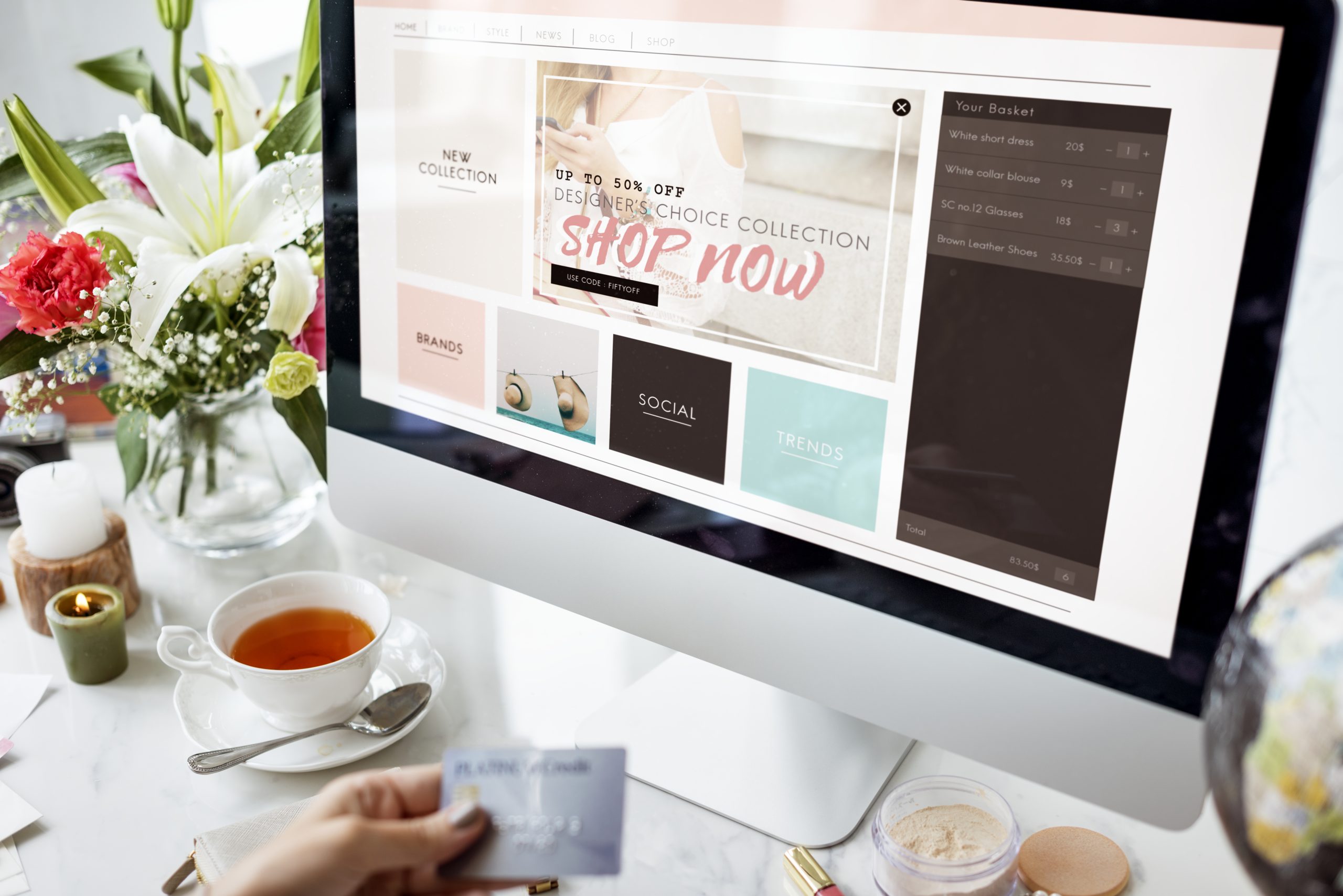
A great product page isn’t about showing your product—it’s about selling it. Yet most ecommerce brands treat their product pages like an online brochure: pretty photos, a few lines of copy, and a checkout button. That’s not enough. Not when attention is limited and competition is everywhere.
Your product page is one of the most important pieces of real estate in your entire business. It’s where hesitation either disappears—or multiplies. And if it’s not built to convert, you’re leaving serious money on the table.
Here’s how to transform your product page from a scroll-past to a sale.
Start with a headline that makes a promise
The first few lines of your product description—or the heading near your product name—should clearly answer: What is this, and why should I want it now? It’s not enough to list the product name. That tells people what it is. But what does it do? Who’s it for? Why does it matter?
Instead of saying:
“Calm Sleep Gummies”
Try:
“Fall asleep faster, stay asleep longer—without next-day grogginess”
When the first thing people read is a benefit they care about, they keep scrolling.
Make your visuals work harder
Yes, product images should be clean and high quality. But they should also tell a story. Show the product from multiple angles. Use lifestyle images so people can imagine themselves using it. Include video, especially vertical video, to showcase texture, movement, or use.
Product in isolation? Good.
Product in someone’s hand? Better.
Product being used in a real moment? Best.
Also: always, always use zoomable images and mobile-friendly galleries. Small details matter.
Turn features into benefits—and make them scannable
A block of text that lists ingredients, specs, or features isn’t persuasive. You need to translate those features into human language. Tell people what those features do for them. Use short bullets, but expand with context when needed.
Instead of:
- 200mg of magnesium
- Vegan formula
- Includes l-theanine
Say:
- 200mg of magnesium to help your body unwind naturally
- 100% vegan formula, zero animal byproducts or fillers
- L-theanine to support focus without jitters
Help your customer imagine the result, not just the ingredient.
Social proof needs to feel real—not staged
Reviews aren’t optional anymore. They’re expected. But they can’t feel like fluff. You want authentic, specific, and recent testimonials. Include photos or videos from real customers if you can. Don’t hide negative reviews—address them honestly and transparently.
And if you’re early-stage and don’t have a ton of reviews yet? Start gathering UGC through post-purchase follow-ups and email prompts. Even one great quote can go a long way.
Also: place your best reviews above the fold, not buried at the bottom.
Build urgency—but make it honest
Urgency works—but fake urgency backfires. Use real constraints when they exist: limited drops, seasonal inventory, or shipping cutoffs.
For example:
“Order by Sunday for delivery before the holiday”
“Only 17 units left—next batch ships in 2 weeks”
These aren’t gimmicks. They’re incentives to act now.
Your CTA button should do one thing: sell the click
This is not the place for creativity. Stick to CTA buttons that are clear, action-oriented, and easy to find.
Good:
- Add to Cart
- Get Yours
- Try It Now
Test placement and color, but don’t bury your button or make people scroll forever to find it.
If your product page isn't converting, it's not because people don’t want what you’re selling—it’s because the page isn’t making it clear, urgent, and trustworthy enough to act. Fix that, and everything from your ads to your email flows will start working better.

Photography That Converts: How to Make Your Product Look Like It’s Already Selling Out
Photography That Converts: How to Make Your Product Look Like It’s Already Selling Out
You’ve probably heard that “content is king,” but here’s a hot take: product photography is your silent salesperson.
Before your product is touched, used, or added to cart, it’s seen. And in ecommerce, a single photo can be the difference between a scroll-past and a sale. It’s not just about looking good—it’s about feeling shoppable.
We’re way past the era of plain white backgrounds and pixel-perfect flat lays. In 2025, the best product photos do three things:
- Stop the scroll
- Communicate value instantly
- Make people imagine owning it
Here’s how to build photo assets that actually move product—not just sit on your homepage.
Start with “the moment” in mind
Most brands shoot products in isolation. It’s clean, safe, and easy. But the photos that convert show your product in real moments—in use, in context, in someone’s hands.
Ask yourself:
- When is my product used?
- What emotion does it create?
- What does that moment look like?
If you sell protein bars, don’t just shoot the bar—shoot someone eating it in the car between meetings. If you sell skincare, don’t just photograph the bottle—show someone applying it in soft bathroom light.
The goal is to trigger imagination. “That could be me.”
Mix formats: every shot has a job
You don’t need 100 images—you need the right mix that tells a full visual story.
Here’s your base shot list:
- Hero shot: Your best-selling product styled clean, bold, centered
- In-use lifestyle shot: Realistic scenario with hands, expressions, props
- Ingredient/details shot: Close-ups of textures, features, labels
- Group shot: Show the product line or bundles together
- Scale shot: Help people understand size (e.g. in hand, next to a known item)
- Movement shot: Pouring, spraying, opening—brings energy to stillness
- UGC feel shot: Slightly raw, natural lighting, handheld style
Each type hits a different conversion point: attention, trust, or clarity.
You don’t need a full shoot—just a plan
Tight budget? No problem. You can get conversion-worthy images with:
- A phone + window light
- Basic foam board or textured paper for backdrop
- 1–2 props that feel brand-right
- A friend or team member as a hand model
What matters more than gear is intent. Shoot with these questions in mind:
- What do I want the customer to feel when they see this?
- Is it clear what the product does and who it’s for?
- Could this stop someone mid-scroll?
Don’t wait for the perfect setup. Build a repeatable one.
Optimize your shots for every use case
Photos aren’t just for the PDP (product detail page). You need assets that:
- Work for paid ads (tight crops, punchy visuals, scroll-stopping)
- Show up well on mobile (clear, bright, uncluttered)
- Fit your brand vibe across touchpoints (email, SMS, packaging, etc.)
- Play nicely with UGC and short-form video (same lighting/look = cohesion)
Before you shoot, decide where each image will live. That prevents waste and builds consistency.
Your images are your brand
People might not read your product description. They might skip your reviews. But they will see your photos—and decide, in under 3 seconds, whether you’re premium, cheap, reliable, cool, or forgettable.
Visual language speaks before words do.
The brands that look like they’re winning? Most of the time, it’s because their visuals told that story first. And the customer believed it.
Great photography doesn’t need a studio—it needs a story.
Know what your product represents. Know what your audience cares about. Then shoot images that show that without saying a word.
That’s how you make people stop scrolling—and start clicking.

How to Write Marketing Emails That Actually Get Opened
How to Write Marketing Emails That Actually Get Opened
For all the talk about TikTok, AI, and creator-led brands, email is still the undefeated champion of direct response marketing. It’s not dead. It’s just been badly abused by brands sending robotic, template-heavy blasts with subject lines that sound like digital wallpaper.
If your open rates are tanking, your emails aren’t getting ignored because people don’t check their inbox—they’re getting ignored because you gave them a reason to skip it. Your job isn’t to create the prettiest email. Your job is to create an email that someone actually wants to open—and maybe even looks forward to.
This isn’t about gimmicks. It’s about respecting attention. Here’s how to write marketing emails that cut through the noise, drive action, and build customer loyalty one subject line at a time.
Why open rates are your first conversion
Think of the subject line as your headline. The email as your pitch. And the click-through as your conversion. If the subject doesn’t spark curiosity or feel relevant, nothing inside the email matters. You’ve already lost.
Most brands focus way too much on the design of the email and not enough on what actually gets it opened. Buttons don’t matter if no one sees them. Carousels don’t matter if your copy is flat. Design supports performance—but it doesn’t create it. The words do.
So if you’re not seeing results from your email campaigns, don’t start by redesigning the template. Start by rewriting the subject line.
The subject line formula that actually works
There’s no magic subject line. But there are patterns that perform again and again because they tap into how people behave—not how brands think.
Here are 5 types of subject lines that consistently drive higher open rates:
- Curiosity-based:
“This changed how I shop forever…” - Benefit-focused:
“Get better sleep in 2 nights—without pills” - Question format:
“Struggling with dry skin this fall?” - Scarcity or urgency:
“Only 3 hours left: 20% off everything” - Personalized:
“Sofia, your refill is almost out”
These subject lines work not because they trick people—but because they speak to real problems, real desires, and real timing. When in doubt, test versions of each type. Your audience will tell you what they respond to.
Why your preheader text matters more than you think
The subject line gets the attention. The preheader seals the deal. That little preview text under the subject line in most inboxes is your second hook—and most brands waste it with “View this email in your browser” or nothing at all.
Use that space to reinforce your offer, create urgency, or deliver context.
Examples:
- Subject: “Something for your Sunday night routine”
Preheader: “Hint: it involves 10 minutes, a warm drink, and zero screens” - Subject: “You're not too late (yet)”
Preheader: “But our last batch of orders ships tonight”
Treat the preheader like the subtitle of a Netflix show. It should pull people in even deeper.
The body of the email: write like a person, not a brand
This is where most emails collapse. The subject line works, the preheader is fine—and then the email opens like a stiff press release or a lazy product dump. Your email copy should read like a helpful note from someone who gets your customer, not like a company brochure.
Good marketing emails are short, skimmable, and anchored in one clear purpose. Don't overload them with five CTAs or jam three campaigns into one message. One email, one goal.
Talk to one person. Use phrases like “you,” “here’s what we thought you’d like,” and “next step.” Drop the brand-speak. People don’t engage with brands—they engage with people. The more natural your copy sounds, the more it gets read.
What to send besides promos
If the only emails you send are discounts and restocks, your audience will learn to ignore you—until they want a deal. That’s not a relationship. That’s a transaction.
Mix in value-driven content that educates, entertains, or empowers. Depending on your brand, this could be:
- A story from a founder or team member
- Tips related to your product’s use (without sounding like a manual)
- Short video links (especially 9:16 verticals)
- Social proof or testimonials
- Behind-the-scenes product insights
- Community shoutouts or UGC highlights
Email isn’t just for pushing product. It’s for building connection. And connection = retention.
Timing and consistency beat overthinking
Brands that overthink email usually underperform. They wait too long, send too little, and second-guess everything. Consistency wins in email. Your list wants to hear from you—remind them that you're here to help, to serve, and to solve something that matters.
You don’t need to send every day. But you do need a cadence they can rely on. Weekly campaigns. Monthly product roundups. Automated flows triggered by behavior. It’s not about blasting. It’s about rhythm.
If you’re not sure where to start, send one value email per week—no pitch, just helpful insight. Build trust. Then earn the right to make an ask.
The TL;DR? Write like a real human who wants to be useful. That’s the kind of email that gets opened. And that’s the kind of email that makes money.

Reels That Actually Build Trust: A Playbook for Founders Who Hate Filming
Reels That Actually Build Trust: A Playbook for Founders Who Hate Filming
Let’s be honest—most founders aren’t trying to be creators. You started a brand, not a vlog. You didn’t sign up to dance on camera, point at text bubbles, or post 12 times a week. But in 2025, the truth is simple: if you’re not showing up on video, you’re losing attention to brands that are.
And no, you don’t need to be flashy, funny, or overly produced. You just need to be believable. Because short-form video isn’t about going viral anymore—it’s about showing your face, your process, and your values in a way that builds trust. That trust? It sells more than any ad.
This is how to show up on Reels as a founder—even if you hate being on camera.
Start with belief, not performance
Forget about algorithms, trending sounds, or trying to act like a creator. You’re not here to perform—you’re here to connect.
Start by asking:
- What do I believe that my customers need to hear?
- What am I building that they don’t see yet?
- What’s the real reason I started this?
If you can answer those out loud, you’ve got your first few Reels. Don’t write a script. Just hit record and talk like you would to a friend. That rawness? It’s what cuts through.
Founders who speak with clarity win—even when the lighting’s not perfect.
5 Reel formats that build trust (and sales)
You don’t need to invent something new every time. Reuse proven formats and put your own voice into them.
- “The Why” video
“Here’s why I built this brand…”
Share the pain point, your frustration, and the shift you’re trying to create. - “Here’s what I wish people knew”
Address a common misconception in your space. Be bold. Take a stand. - “A customer asked me this…”
Answer real questions you’ve gotten. Use it as social proof + education. - “A day in the business”
Behind-the-scenes. Product fulfillment. A supplier call. The real stuff. - “3 things I’ve learned”
Reflect on the journey. Be honest. People trust founders who show the mess, not just the highlight reel.
The best-performing founder Reels aren’t fancy—they’re felt.
Don’t batch content—batch confidence
Here’s the trap most founders fall into: they try to film 10 videos in one day, get overwhelmed, and give up. Instead, build a system that works with your energy.
Try this:
- Pick 1 day a week to shoot
- Film 2–3 videos, no editing required
- Post them raw, or with minimal captioning
- Use tools like Captions or Descript to add subtitles in 2 minutes
- Move on
Over time, you’ll stop hating the camera—and start owning it.
What actually matters (and what doesn’t)
What matters:
- Message clarity
- Tone of voice
- Eye contact
- Posting consistently
What doesn’t:
- Fancy gear
- Perfect lighting
- Matching the trend
- “Crushing it” energy every time
Some of the highest-converting Reels we’ve seen from founders were filmed on the floor, in a hoodie, just speaking the truth. That’s what your audience wants.
Founder content isn’t optional anymore—it’s the brand
When you show up on video, you collapse the distance between you and your customer. They don’t just buy from a store—they buy from a person. Someone they like. Someone they trust.
You don’t need to be charismatic. You need to be clear, consistent, and real.
Because people don’t trust brands.
They trust founders who talk to them like humans.

How to Build a Marketing Strategy From Scratch (Without Losing Your Mind)
How to Build a Marketing Strategy From Scratch (Without Losing Your Mind)
Creating a marketing strategy from zero can feel overwhelming. There’s pressure to do everything at once—ads, content, email, influencers, SEO. And the moment you start Googling frameworks, you’re hit with diagrams, funnel shapes, and spreadsheets that make it all feel even more complicated.
But here’s the truth: you don’t need a perfect strategy. You need a clear one. One that’s simple, focused, and built to evolve as you grow.
If you're starting fresh—whether you're launching a brand, reviving a business, or finally getting serious about growth—this is how to build a strategy that actually moves the needle, step by step.
Start with one goal
Your marketing strategy needs a single, measurable goal to anchor everything else. Not five. Not a vague “build awareness.” Pick one.
That goal could be:
- Get 1,000 email subscribers
- Drive 100 purchases this month
- Book 10 discovery calls
- Hit $25K in monthly revenue
Once you have that target, every channel, campaign, and creative decision gets run through one filter: Does this move us toward that goal?
Clarity kills overwhelm.
Know exactly who you're trying to reach
If your strategy is trying to speak to everyone, it’s speaking to no one.
Create a real profile of your ideal customer—what they’re struggling with, what they want, where they spend time, and how they make buying decisions. Forget demographics. Focus on desires, fears, and beliefs.
If you can finish this sentence, you’re ahead of most brands:
“Our customer is trying to solve ______, and believes ______.”
That belief drives how you position, what you say, and where you show up.
Pick your core channels (and ignore the rest—at first)
One of the fastest ways to fail is trying to show up everywhere with limited time and money. You don’t need to be on every platform—you need to own the ones that matter most to your audience.
For example:
- A skincare brand might focus on TikTok and email
- A B2B service might go heavy on LinkedIn and organic SEO
- A new food product might start with Instagram + IRL sampling
Start with two channels max: one that builds awareness, and one that nurtures conversion. Once those are running smoothly, expand.
Map your funnel (without making it a funnel)
Forget about fancy diagrams. Just ask:
- How do people discover us?
- What convinces them to try us?
- What makes them stick around?
Those three stages define your content and campaign strategy.
Discovery = content (short-form video, search, partnerships)
Conversion = proof and clarity (landing pages, email, retargeting)
Retention = value and relationship (community, SMS, surprise perks)
If you're clear on these, you’re building more than a strategy. You're building a system.
Create a 30-day sprint, not a 12-month plan
Long-term strategy is important—but don’t fall into the trap of planning everything in theory. Start small. Run a 30-day sprint focused on your goal.
Set a few key actions:
- Launch 2 ad creatives
- Publish 8 pieces of content
- Run 1 offer
- Send 4 emails
Measure what happens. Adjust. Repeat. Marketing isn’t a perfect blueprint—it’s a living feedback loop. You learn by doing.
A marketing strategy doesn’t have to be complex to be effective. It just needs to be honest, focused, and tied to what actually matters to your customer. Don’t try to build the “perfect” plan. Build a real one—then get moving.

Why You Need Vertical Video in Your Brand Playbook
Why You Need Vertical Video in Your Brand Playbook
There’s no debate anymore—vertical video isn’t optional, it’s essential. What started as a format trend on Snapchat and TikTok has now become the dominant way people consume content. Instagram Reels, YouTube Shorts, even Pinterest and LinkedIn now prioritize vertical formats. Why? Because that’s how we hold our phones. That’s how we scroll. And that’s where your audience is paying attention.
But here’s the real kicker: vertical video isn’t just a formatting change. It’s a shift in storytelling, pacing, and performance. Brands that fail to adjust aren’t just missing engagement—they’re missing relevance.
Let’s unpack why vertical video matters so much right now, what it does differently, and how to actually use it to drive brand growth.
Vertical video isn’t just native—it’s dominant
The average person watches mobile content in vertical orientation over 90% of the time. That alone should make this a no-brainer. But it’s not just about the screen—it’s about algorithmic preference. Platforms like TikTok and Instagram don’t just accept vertical video, they prioritize it.
Even more: vertical video drives higher watch time, more shares, and faster feedback loops than horizontal content. It fills the screen, creates intimacy, and breaks the polished ad fatigue people have developed over the last decade.
When a user swipes into your video, and it feels native—unforced, vertical, direct-to-camera—they’re more likely to stay. When your video is horizontal or overly branded, they scroll past it like an ad they didn’t ask for.
What vertical video does differently
Vertical video forces clarity. You only have one focal point. You only have a few seconds. You only have a small window to earn attention.
This is a blessing in disguise. It pushes your brand to:
- Lead with the hook
- Simplify the message
- Show instead of explain
- Use faces, motion, and emotion more effectively
A strong vertical video isn’t just “good creative.” It’s a micro-story. It’s a 9:16 billboard in motion.
Likewise, it can be as simple as:
- A customer holding your product and saying why they love it
- A founder explaining one powerful benefit
- A behind-the-scenes clip that breaks the fourth wall
- A bold on-screen question that stops the scroll
Don’t overthink the production. Think in moments, not in minutes.
The algorithm loves vertical—but the funnel still matters
Here’s where most brands go wrong: they think vertical video is about going viral. That’s a side effect—not a strategy.
The real play is to use vertical video to support your entire marketing funnel.
Top-of-funnel: hook-based videos that grab attention with relatability or curiosity
Mid-funnel: benefit breakdowns, customer reviews, product use demos
Bottom-of-funnel: objection handling, urgency-driven offers, testimonials with punch
Each one of these can be filmed vertically, edited fast, and deployed across channels—from TikTok and Reels to SMS and landing pages.
You’re not just chasing attention. You’re building momentum.
A vertical-first mindset changes your content game
When you start thinking vertical-first, everything gets simpler.
- You plan content around real people, not perfect sets
- You prioritize ideas over polish
- You multiply outputs from single shoots
- You adapt to how your audience actually consumes, not how you prefer to create
It’s a shift in posture—from corporate marketing to conversation. From campaign to communication.
And when your brand starts showing up this way—more often, more casually, more natively—you start to win attention organically and consistently.
Vertical isn’t a trend. It’s the standard.
Still thinking of vertical video as “something extra” for social? That mindset is a liability now. This isn’t a trend. It’s how content works. It’s how discovery happens. And it’s where your customer is already spending their time.
You can keep investing in long-form landscape content that no one sees, or you can start showing up where your audience already is—with the stories that fit their screen, pace, and expectation.
The brands that win aren’t the ones with the best production budget. They’re the ones that adapt faster, speak clearer, and show up consistently in the right format.

Conversion-Driven Design: How to Stop Making Pretty Things That Don’t Sell
Conversion-Driven Design: How to Stop Making Pretty Things That Don’t Sell
Design can make your brand feel polished, premium, and trustworthy. But if it doesn’t drive action, it’s not doing its job. The truth is, most early-stage brands over-prioritize aesthetics and under-prioritize performance. They end up with gorgeous websites, clever animations, and branded layouts that don’t actually convert visitors into customers.
This happens all the time—especially in DTC, wellness, and consumer brands. Founders fall in love with the look, not the function. Designers optimize for visual harmony, not user flow. And marketers are left wondering why conversion rates flatline.
Design isn’t just how something looks. It’s how it works. And if it’s not guiding people toward a clear action, it’s just expensive decoration.
Let’s break down how to shift from “pretty” to “profitable.”
Design should clarify, not confuse
Good design eliminates friction. It makes the next step feel obvious and inevitable. When your site or landing page is overloaded with fancy layout tricks, vague headlines, or scattered navigation, users don’t lean in—they leave.
Ask yourself: Can someone tell…
- What I’m selling?
- Who it’s for?
- Why it’s different?
- What they should do next?
If those aren’t answered visually and verbally within the first few scrolls, it doesn’t matter how slick the site is. You're leaking revenue.
The fix? Build for clarity before cleverness. Your homepage isn’t a canvas. It’s a funnel.
Visual hierarchy is the silent hero of every high-converting page
You don’t need to shout to be heard—but you do need to guide the eye. Visual hierarchy is what helps people process information in the right order. It’s what turns a busy page into a clear, persuasive message.
Every section of your page should follow a rhythm:
- Bold, direct headline (the “why care?”)
- Short subtext (the “how does this help?”)
- Visual that reinforces the message (product in action, not just product)
- Clear CTA (button with specific intent)
Good hierarchy builds momentum. It makes people want to keep scrolling because it feels effortless.
Bad hierarchy makes them guess what’s important. That kills trust.
Aesthetic doesn’t equal premium—confidence does
Minimalist design isn’t inherently better. In fact, it often hides weak messaging. Brands that lean too hard on white space and moody fonts often forget that their job is to communicate, not just “look elevated.”
True premium brands are clear, confident, and unafraid to speak directly. That means using bold headlines, real customer proof, and clear actions—even in a clean aesthetic.
What feels premium is not silence. It’s conviction. Premium doesn’t whisper. It communicates value without friction.
Design for speed, not just style
You have less than 3 seconds to make someone stay. If your site is loading slowly because of oversized images, custom fonts, or unnecessary motion, you’re paying the price in bounce rate.
Speed is design. Every animation, scroll effect, or embedded video needs to earn its place. Run your site through PageSpeed Insights and strip anything slowing you down.
If your homepage looks amazing on desktop but crashes on mobile, you’ve already lost the game.
How to audit your current design for conversion (simple checklist)
Here’s a 5-minute test you can run right now on your own site or landing page:
Above the fold test:
In the first 5 seconds, can a cold visitor tell what you do and who it’s for?
CTA visibility:
Is there a bold, contrasting CTA button visible within the first viewport?
Visual support:
Do your images and videos show the product in action—or are they just aesthetic?
Proof:
Do you have real testimonials, reviews, or social validation before asking for a purchase?
Clarity check:
Read your copy out loud. Does it sound like something a person would say, or something a designer wrote to sound clever?
If you fail more than two of these, your design isn’t working as hard as it should.
What conversion-first design actually looks like (examples)
Let’s say you sell an adaptogenic tea brand. Here's how your homepage could look depending on your design mindset:
Design-first mindset:
- Hero image of leaves blowing in the wind
- Tagline: “Brew Balance”
- CTA buried in the nav
- Product buried two scrolls down
- No reviews or explanation of ingredients
Conversion-first mindset:
- Hero image: person drinking tea with headline: “Reduce stress in 5 minutes. No pills.”
- Clear CTA: “Try the Starter Kit”
- Subheadline: “Backed by clinical herbs and 1,500+ 5-star reviews”
- Product benefits + UGC video immediately visible
Same brand. Same product. One sells. The other just vibes. When you start designing for conversion, your metrics change. Time on site goes up. Bounce rate drops. Clicks rise. And most importantly—sales happen. You don’t have to choose between beautiful design and performance. But if you want results, beauty should serve the goal—not distract from it.

9:16 vs 16:9: Which Format Wins in 2025?
9:16 vs 16:9: Which Format Wins in 2025?
If your brand still treats vertical video as an afterthought, you’re missing where the culture is already living. There’s a reason TikTok has dominated attention spans, Reels became Instagram’s default format, and YouTube Shorts exploded overnight. The traditional 16:9 landscape format still has its place, especially in high-production storytelling and long-form YouTube, but the shift toward 9:16 is no longer a trend—it’s the new standard for attention in the mobile-first world.
Let’s unpack what makes each format powerful, when to use them, and how to structure your content strategy in 2025 so you’re not just creating—you’re converting.
The Rise of 9:16 — Why Vertical Rules Mobile
Open your phone. Scroll Instagram. Scroll TikTok. Scroll YouTube. What you’re consuming is vertical content that feels native, fast, raw, and—most importantly—personal. The 9:16 format dominates not because it's more cinematic or more flexible (it's not), but because it's frictionless. You don’t need to rotate your device. You don’t need to pause and focus. It meets people where they are—literally, in the palm of their hand.
Beyond convenience, vertical video benefits from platform bias. TikTok, Reels, and Shorts are prioritizing it algorithmically. Creators and brands producing in 9:16 have better reach, better engagement, and more discoverability. Brands still clinging to 16:9 for all content are effectively whispering in a room where everyone else is shouting—and getting heard.
That said, vertical is not a blanket solution for everything. It’s phenomenal for short-form hooks, brand teasers, social proof snippets, and user-generated content. But not all brand stories can be told in 30 seconds. That’s where horizontal still matters.
When 16:9 Still Wins — And Why You Shouldn’t Abandon It
The 16:9 format is far from dead. It’s just become more specialized. Think of it like this: 9:16 is for the hallway conversations. 16:9 is for the main stage.
When you're telling a deeper brand story, shooting a founder documentary, demoing a product in long form, or educating your audience in 5+ minute videos, landscape video creates space for narrative. It feels professional. It signals production value. It performs well on platforms that still prioritize traditional formats like YouTube, embedded video players on websites, or B2B-style content libraries.
Where vertical is reactive and punchy, horizontal is considered and immersive. That distinction matters.
But the biggest mistake brands make? Treating the two as opposing options. They’re not. They’re tools—and smart brands use both intentionally.
The Strategy Is in the Stack—Not the Format
Here’s where most content teams miss the opportunity: they treat video creation as a linear process instead of a layered one. In 2025, the smartest brands are building content stacks—starting with one anchor shoot and extracting both vertical and horizontal assets from the same footage.
Let’s say you record a 20-minute behind-the-scenes video with your founder explaining the “why” behind your product. In 16:9, that becomes a branded video on YouTube and your website. But inside that footage are 5–10 moments that can be repurposed as 9:16 vertical clips—pulled quotes, funny moments, sharp insights, product demos. Now you’re feeding multiple platforms without needing entirely new shoots. That’s leverage.
Instead of asking, “Should we shoot vertical or horizontal?”, the better question is, “What’s the core story we’re telling, and how do we adapt it to each format?”
How to Structure Your Content Plan Around Both
In practice, here’s how we structure this for brands inside Youngry:
- Weekly Short-Form (9:16):
3–5 vertical clips per week, filmed or repurposed from larger shoots. These live on TikTok, Instagram Reels, YouTube Shorts, and even email/SMS. - Monthly Long-Form (16:9):
1–2 pieces of deeper content. Could be educational, founder-led, narrative-driven, or product walkthroughs. This is what goes on your YouTube channel and becomes blog/video embeds on your site. - Quarterly Studio Days:
Full-day production sessions that capture both formats from the jump. With the right planning, one shoot can fuel 30+ content assets across channels.
By using this cadence, you ensure that your brand doesn’t just have “content”—it has content that makes sense in the context it’s consumed.
The Bottom Line
This isn’t a 9:16 vs. 16:9 debate. It’s a “how do you speak to your customer where they are right now?” conversation.
Vertical is your daily conversation. Horizontal is your keynote. One grabs attention, the other builds depth. Both matter.
The winning brands in 2025 are fluent in both formats—and strategic in how they use each one to pull people deeper into the funnel.
Don’t choose a side. Choose to communicate better.

Performance vs. Brand Marketing: Which One Does Your Business Actually Need?
Performance vs. Brand Marketing: Which One Does Your Business Actually Need?
It’s the debate that haunts every founder, CMO, and marketer with a limited budget:
Should we focus on performance—ads that convert?
Or should we invest in brand—content that builds long-term loyalty?
The truth is, you need both. But depending on your stage, product, and goals, one may need to lead.
Understanding the difference—and how to balance them—is what separates brands that flash and fade from the ones that scale with consistency.
Let’s break it down.
What performance marketing actually does
Performance marketing is built to drive a specific action, usually in a short timeframe. Think Meta ads, Google search campaigns, retargeting, conversion-focused emails—anything that’s trackable and tied directly to ROI.
It’s fast. It’s measurable. It’s scalable.
This is where you test offers, learn what messaging converts, and drive immediate results. If you’re launching a product, trying to grow revenue this quarter, or prove traction to investors, performance is your workhorse.
But there’s a catch: performance alone can’t build belief. It can bring people in—but it can’t always make them stay.
What brand marketing does differently
Brand marketing plays the long game. It builds emotional connection, story, and memory. It’s what makes someone choose your product over a cheaper one. It’s why they wear your hoodie, not just buy your product.
Brand marketing shows up in:
- Founder stories and origin content
- Behind-the-scenes posts
- UGC and community features
- Educational series
- Thoughtful packaging and tone of voice
- Campaigns that spark emotion, not just clicks
Done right, brand makes your performance marketing cheaper. Because people already know who you are when they see the ad.
The real question: what’s your constraint?
If your business needs cash flow right now, go heavier on performance. But if your ROAS is dropping, CAC is rising, and retention is flat—chances are you’ve leaned too far in and neglected brand.
Here’s a simple matrix:
| Your Problem | What You Likely Need More Of |
|---|---|
| Low sales | Performance |
| High churn | Brand |
| Low site traffic | Performance |
| Weak retention | Brand |
| Great ROAS, no followers | Brand |
| High followers, low sales | Performance |
Balance is the goal. But balance doesn’t mean equal. It means strategic allocation.
What it looks like to run both at once
Let’s say you’re launching a new CPG product. Here’s how you might split your energy:
-
Performance side:
-
Launch ads with strong hooks + clear CTA
-
Retargeting flows via email/SMS
-
Offer-based landing pages
-
-
Brand side:
-
Document the launch story on social
-
Share behind-the-scenes of product development
-
Collaborate with micro-creators on UGC
-
Invest in storytelling video assets
-
Each supports the other. The performance side drives sales. The brand side builds affinity and lowers CAC over time.
What founders get wrong about brand vs. performance
The biggest misconception is that brand is a luxury and performance is a necessity. That’s backwards.
Brand is the reason people choose you in the first place—and the reason they come back. If you build performance without brand, you’re renting growth. As soon as you stop spending, everything dries up.
On the flip side, if you go full brand with no performance, you risk beautiful content with no cash flow.
This isn’t either/or. It’s both, in the right ratio.
Every business hits a point where pure performance stops working. That’s your cue to build brand. And every brand that only vibes eventually needs performance to scale. If you want to grow sustainably, the question isn’t “Which one should we do?”
It’s: What’s the smartest way to blend both—right now?

Is Your Website Just Pretty—or Does It Actually Convert?
Is Your Website Just Pretty—or Does It Actually Convert?
A beautiful website that doesn’t convert is like a Lamborghini with no engine. Sure, it looks great in screenshots. But it’s not going anywhere.
Founders and marketers spend weeks (sometimes months) obsessing over typography, animations, color palettes, and “vibe”—and then forget that the primary purpose of a brand site is to move people toward action. Whether it’s buying a product, booking a service, or signing up for more info, your website isn’t just a brand asset. It’s a sales platform.
If your traffic looks good, but your revenue doesn’t reflect it, your site isn’t converting. And odds are, design isn’t the issue—it’s clarity, structure, and messaging.
Let’s walk through how to tell if your website is just pretty… or actually doing its job.
What Makes a Website Convert in 2025
Conversion today isn’t about flashing banners or aggressive CTAs. It’s about user trust, clarity, and intuitive experience. Visitors decide within seconds whether they’re in the right place—and whether they believe your offer is for them.
If your homepage doesn’t immediately communicate who you help, how you help them, and what they should do next, you’re already leaking revenue.
Here’s what high-converting sites consistently get right.
Clear, Outcome-Driven Messaging
Your headline should answer the question: Why should I care, and what’s in it for me? This is not the place for abstract taglines or clever phrases. Save the poetry for your manifesto.
Great homepage headers look like:
- “Clean skincare made for sensitive skin—no fluff, no fragrance”
- “Better sleep in 14 days, backed by real data”
- “From concept to launch: Launch your brand in 90 days or less”
Immediately establish relevance. Be direct. Lead with results, not features.
One Core CTA, Repeated Often
Don’t make visitors hunt for where to click. Pick one primary call to action (buy, book, subscribe, apply) and repeat it up and down the page. Use contrasting buttons. Test different CTA copy (“Get Started” vs. “Try Risk-Free”) but stay consistent with the action itself. You’re not being pushy—you’re guiding.
Social Proof That Feels Real
Skip the generic “What people are saying” carousel. Use real testimonials, real faces, and quantifiable results. Even better, embed short UGC videos, customer quotes from support tickets, or screenshots of real DMs. Authenticity converts better than polish.
If you’ve been featured anywhere legit, add logos—but don’t let them overpower the rest of your content.
Mobile-First, Not Mobile-Friendly
Over 70% of your visitors are seeing your site on their phone. If your mobile experience is slow, clunky, or cuts off key messaging, you’re throwing away traffic. Buttons should be thumb-friendly. Text should be scannable. The add-to-cart experience should be frictionless. Test on multiple devices—not just your laptop.
Where Most Sites Lose Conversions (And How to Fix It)
The most common mistakes we see across ecommerce and brand sites aren’t technical—they’re strategic.
The Homepage Doesn’t Answer “Why Now?”
If your product or offer feels optional, people will treat it that way. Use urgency, seasonal context, or time-sensitive benefits to create immediacy.
Examples:
- “Fall inventory shipping now—limited stock”
- “Spots for January brand launches are already 80% booked”
- “Order by Tuesday to receive it before Sunday”
Deadlines move people.
There’s No Clear Visual Hierarchy
If everything on your page is loud, nothing gets heard. Use spacing, font weights, and layout to guide the eye from headline to CTA. Strip out anything that’s not helping the scroll.
Look at your homepage as a story: does it hook attention, create belief, show proof, and offer a clear next step?
The Site Focuses Too Much on You
“We’re a small team of passionate makers...”
“We believe in quality and sustainability...”
Cool. But how does that help the customer?
Make the visitor the main character. Rewrite your copy from their point of view. Every section should answer: What does this mean for me?
Audit Your Site in Under 10 Minutes
If you’re unsure whether your website is working, run this quick test.
- Open your homepage. Show it to someone unfamiliar with your brand for 10 seconds.
- Ask them: What do we sell? Who is it for? Why buy now?
- Scroll the page yourself. Does every section earn its place—or is it just filling space?
- Click through the purchase flow. Is it smooth, fast, and obvious what happens next?
- Pull up your site on mobile and test every button and form.
The goal is not just usability—it’s momentum. Every click should build confidence, not confusion.
A Website That Converts is a Business That Grows
You don’t need a fancier homepage. You need a site that speaks clearly, guides confidently, and sells effectively. When your website is aligned with how your customer thinks and what they care about, everything gets easier: ad performance, retention, referrals, and revenue.
Design is important. But clarity wins.